Case study · LearningSuite Flexco, Graz
Modular AI-Agents
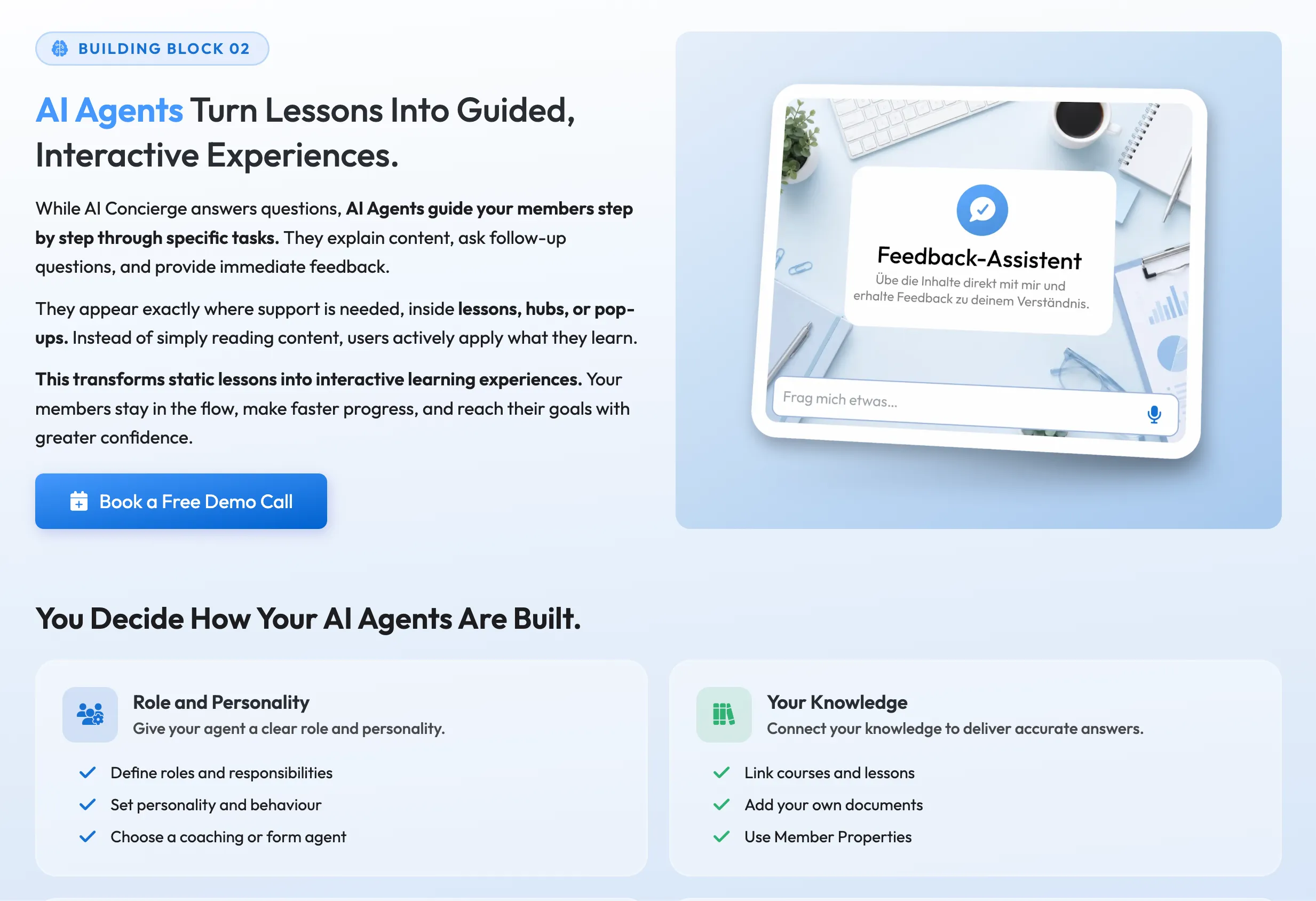
Three kinds of customer wanted AI agents in their courses, and none of them wanted the same agent. My work here is the configurator that lets an owner build one and put it where the help is actually needed: in a lesson, in a hub, wherever a member gets stuck.
- Role
- UX/UI design, in-house: the agent configurator, from research through handover and QA
- Product
- LearningSuite Intelligence: AI agents inside the learning platform
- Timeline
- End of 2025 to July 2026
- Scope
- Research · Interaction design · UI · Design handover · QA · Web page
01Three audiences
A learning platform's owners are not one audience. LearningSuite's split three ways: organisations running staff onboarding, coaches teaching their own method, and agencies building courses for clients. All three wanted AI agents working inside their content. None of them wanted the same agent.
That leaves two obvious answers, both bad. An agent with fixed behaviour is useless to all three, because the value of the agent emerges when it's customised for the owner. An agent that exposes every parameter is a control panel, and owners abandon control panels. Therefore the goal was to find a solution that offered customization without being overwhelming.
The configurator has a second job beyond building the agent: giving the owner an idea of how it will look across their platform. Making sure the agent matches the premium design language of LearningSuite while allowing it to be universally used was another important goal.
Full customisation that never once looks like configuration.
02Research
I started by taking apart the agent builders that already exist: what they let you change, what they decide for you, and where they stop. That maps the full range of things a person could adjust, which is not the same as the things worth adjusting.
The filter came from the three groups. A coach needs the agent to sound like them, because their voice is the product. An agency needs to hand over something finished, with their client's name on it. An organisation needs it to stay inside what the company will stand behind, which is a question about permissions before it is a question about tone.
Customer support supplied the actual voices. They had been answering questions about this before it existed, so what people asked for was already written down. One could argue that a support inbox is a better requirements document than a workshop, because most people in it are being polite.
03Three tabs
The first version was a setup flow: four screens in a fixed order, Continue at the bottom of each one and Finish at the end. I presented this to the owners. It looked perfectly sensible, and it was wrong for a reason that turns out to be about frequency rather than layout.
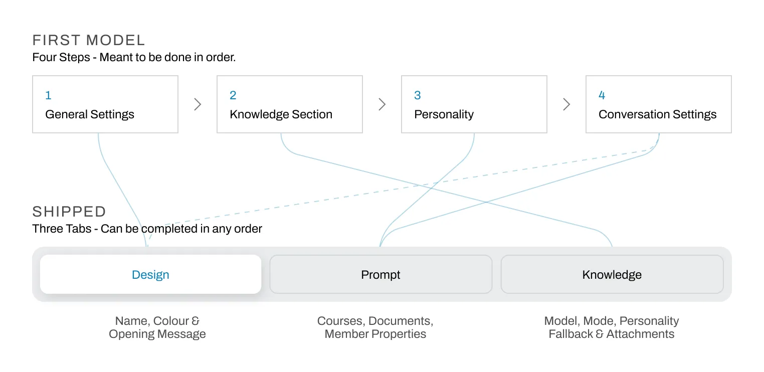
A step-by-step flow makes a promise about how often this happens: once, in order, and then you are done. Agents are not like that. An owner comes back to soften a fallback message, swap the model, add a document, narrow which courses the agent is allowed to read. Under the flow, every one of those visits meant walking four screens to change one field.
Two of the four steps were also named after nothing in particular. General Settings and Conversation Settings are what a group gets called before anybody has decided what belongs in it, and things arrive in them by default rather than by argument. The fourth step gives it away: the opening message and the fallback message sat together because both had the word conversation in the title. They went to different tabs the moment anyone asked what an owner is actually doing when they write each one.
What shipped is three tabs and no sequence at all. Design is how the agent presents itself: name, colour, the first thing it says. Prompt is how it behaves: model, mode, personality, and what it does when it does not know. Knowledge is what it may draw on: courses, documents, member properties, and the limits on each. There is no more forced step-by-step process.
Two constraints held the whole way through. It had to feel like the rest of the product, which is premium and quiet. And it had to be explainable in one sentence by somebody in sales who is not a designer. Both of those pull hard against elaborate interfaces, which turns out to be a useful pressure to design under.
04Handover
Wireframes first, and deliberately rough, because a draft that looks finished stops getting argued with. That draft went in front of the owners, customer support and the developers together: the owners for direction, support for what customers would actually hit, the developers for what was possible and for the things I had not thought about. Most of what changed at this stage came from the third group.
Then a high-fidelity prototype in Figma, and several rounds on it before anyone built anything. Handover to the development team, and when the first build landed on staging I went through it, wrote up what had drifted, and sent it back.
05The page
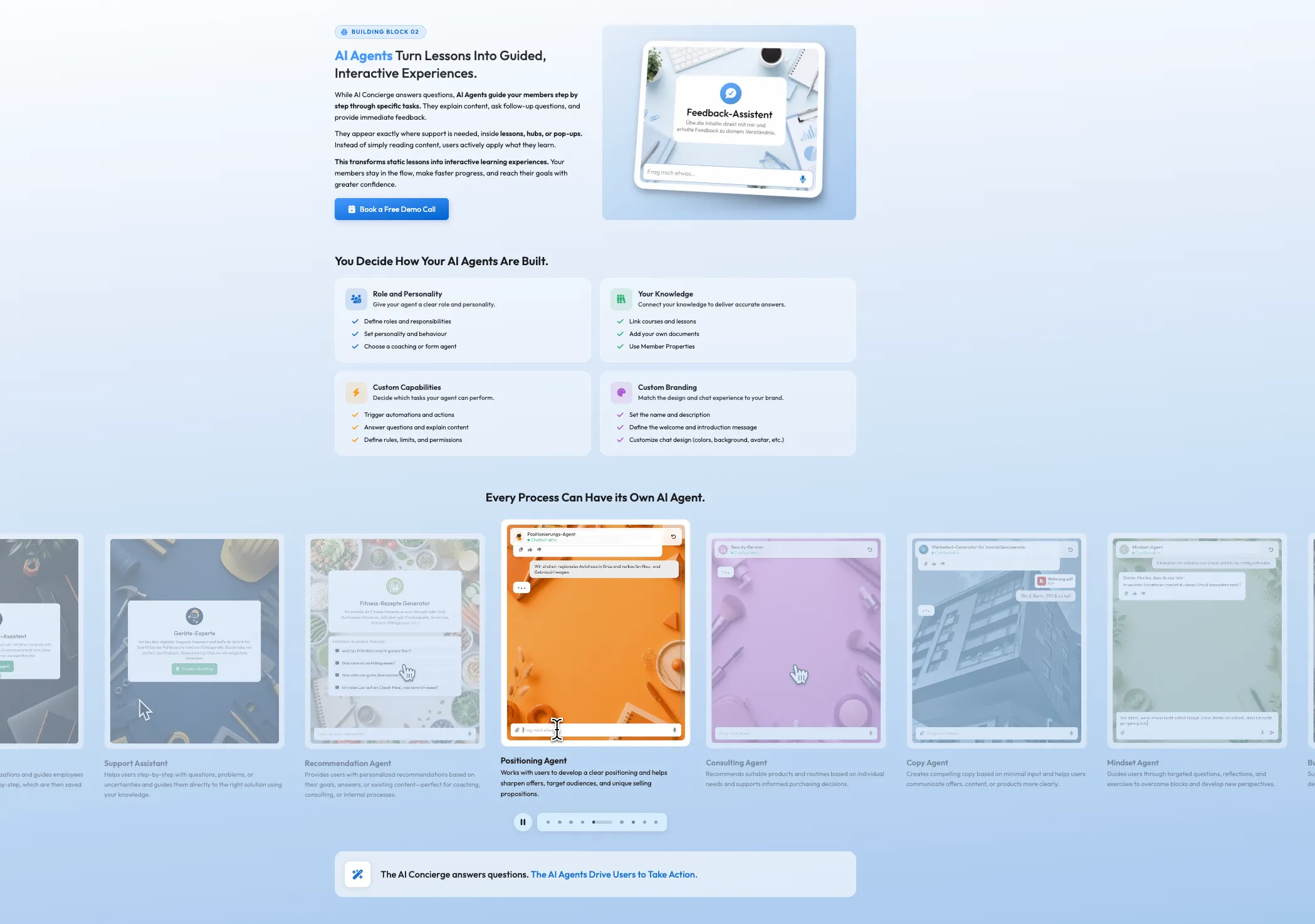
Then I designed the page that has to explain it. I was hired as a UX/UI designer. However, when the opportunity arose to manage the websites as well, I took it, so alongside the product work I now design and run both company sites. LearningSuite Intelligence is mine end to end: I designed it, briefed the graphic designer on the visuals, built it in Webflow and took sign-off from the owners directly. It is also the largest page I have ever built, and this only after having worked with Webflow for about three months.
Explaining a configurator is its own problem. Nobody scrolling has an agent in front of them, so the page has to make an abstract capability feel concrete before it asks for anything.
I was learning as I went, and that was noticeable in the process. I set the main heading as an SVG because it looked exactly right, which meant the most important line on the page was a picture of words instead of words: nothing for search to read, nothing for a screen reader to say. I also designed it on a fast internet connection and almost forgot about users on a slow one, so optimising the whole page for weight became a pass at the end rather than a constraint I worked under from the start. Both are the kind of thing you only make once.
The larger thing I was learning is what intentional design means on a page rather than on an object. I know how to make a physical thing declare what it does; doing that with scroll, rhythm and restraint was new, and I was doing it on the biggest thing I had made with a tool I barely knew. Webflow also limits you with its own UI, so I iterated with Claude on the custom code that got past those limits, which let me try more versions than I could have built with Webflow alone. I specified, directed and reviewed.
The webpage is the most developed one I have made at LearningSuite, and because it is public it is the one piece of my production work anybody can open and judge for themselves, mistakes included.
learningsuite.io/en/ls-intelligence
Now
This page gives an insight into what I am working on at the moment. UI was the part of the craft my industrial-design training touched least.
Shaping an object so it says what it does, I could do. Hierarchy, states, and the quiet consistency of a product somebody opens every morning were somebody else's department.
Production work has changed that, and has helped me to become an even more polished designer. I'm not just able to create physical solutions but also aesthetic digital ones.
